I a |

featured image

Visualize Indonesia's Population Data using ggplot2

Intro

Many people say that ggplot is a powerful package for visualization in R. I know that. But i’d never triggered to explore this package deeper (except just to visualize mainstream plot like pie chart, bar chart, etc.) till this post impressed me.

That post is about plotting map using ggplot. The pretty plots resulted on that post challenged me to explore ggplot more, especially in plotting map/spatial data.

Preparation

We always need data for any analysis. The author of those post use USA map data available in ggplot2 package. Though that post is reproducible research (data and code are available) menas i can re-run the examole on my own, but I want to go with local using Indonesia map data.

So, objective of this post is to visualize Indonesian population by province in Indonesia. So we need the two kinds of dataset. First is population data in province level and second is Indonesia map data. The first data is available in BPS site. The data consists of population density (jiwa/km2) for each province in Indonesia from 2000 till 2015. I will go with the latest year available on the data which is 2015.

Oke, now we arrive to the hardest part. I stacked for a while when searching Indonesia map data that suit for ggplot2 geom_polygon format. But Alhamdillah, after read some articles about kind of spatial data, I got one clue, I need shape data with .shp format to plot map data. And just by typing “indonesian .shp data” on google, He will provide us tons of link results. Finally, I got Indonesian .shp data from this site. I downloaded level 1 data (province level) for this analysis.

Data Acquisition

The fist step is load data into R. I use rgdal package to import .shp data. rgdal is more efficient in loading shape data compared to others package like maptools, etc.

1
2
3
4
#import data .shp file
library("rgdal")
#import .shp data
idn_shape <- readOGR(dsn = path.expand("/YOUR_PATH/IDN_adm"), layer="IDN_adm1")

Here’s one of the advantages using rgdal package, though it is in shape format we can use operation like names(), table(), and $ subset operation like in data frame format.

After data loaded into R workspace, we need to reformat shape data into format that suit to ggplot2 function.

1
2
3
4
#format data
library("ggplot2")
idn_shape_df <- fortify(idn_shape)
head(idn_shape_df)
1
2
3
4
5
6
7
##       long      lat order  hole piece id group
## 1 96.23585 4.055532     1 FALSE     1  0   0.1
## 2 96.23552 4.055860     2 FALSE     1  0   0.1
## 3 96.23448 4.056840     3 FALSE     1  0   0.1
## 4 96.23372 4.057950     4 FALSE     1  0   0.1
## 5 96.23324 4.058574     5 FALSE     1  0   0.1
## 6 96.23248 4.059689     6 FALSE     1  0   0.1

data will look like above table.

Next step, we will try to visualize the data we already have

1
2
3
4
#visualize as in data
ggplot() +
  geom_polygon(data = idn_shape_df, aes(x=long, y = lat, group = group)) +
  coord_fixed(1.3)

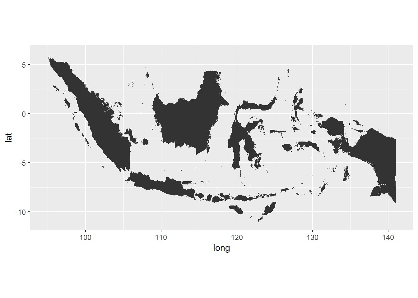
It works!, my data has suitable for ggplot2 format. Let’s make it more colorful by colorize each province.

1
2
3
4
5
#add color by province
ggplot(data = idn_shape_df) +
  geom_polygon(aes(x = long, y = lat, fill = id, group = group), color = "white") +
  coord_fixed(1.3) +
  guides(fill=FALSE)  # do this to leave off the color legend

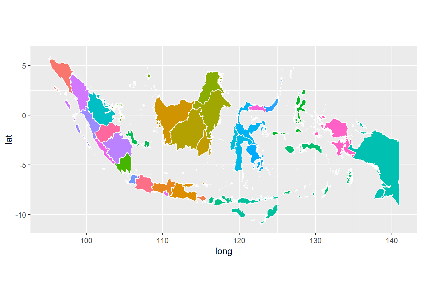
Cool! looks much better. But that’s not the goal of this analysis. Let’s moving forward. Now need to add population density data to complete the analysis.

1
2
3
4
#import density data
population <- read.csv("/Users/Muhammad Idrus F/Downloads/bps-file.csv", sep=";")
population <- population[,c(5,6)] #put only needed variable
head(population)

to make it more intuitive, let’s change the column name with what it should be.

1
colnames(population) <- c("density", "provinsi")

population data has two column; provinsi and density with 34 rows fit to the number of province in Indonesia from Aceh to Papua. Next, we need to merge population dataset with idn_shape_df dataset. If you look in idn_shape, the id column in idn_shape dataset represents the province name. So, the id column in idn_shape_df should represents province name too. Then value in id column better we replace by province name.

1
2
3
#we need to creat dict of province id first
dict_prov_id = data.frame(idn_shape$ID_1, idn_shape$NAME_1)
colnames(dict_prov_id) <- c("id", "provinsi") #rename the column name

Before we join, we notice that id index on idn_shape_df somehow start from 0 while id index on idn_shape. We need transform id on the two tables to be identical.

1
2
3
idn_shape_df$id <- as.integer(idn_shape_df$id) + 1 #transform id value to be similar with id on idn_shape table due to different initial index
idn_shape_df$id <- with(dict_prov_id, provinsi[match(idn_shape_df$id, id)])
head(idn_shape_df)
1
2
3
4
5
6
7
##       long      lat order  hole piece   id group
## 1 96.23585 4.055532     1 FALSE     1 Aceh   0.1
## 2 96.23552 4.055860     2 FALSE     1 Aceh   0.1
## 3 96.23448 4.056840     3 FALSE     1 Aceh   0.1
## 4 96.23372 4.057950     4 FALSE     1 Aceh   0.1
## 5 96.23324 4.058574     5 FALSE     1 Aceh   0.1
## 6 96.23248 4.059689     6 FALSE     1 Aceh   0.1

Now shapefile data idn_shape_df are ready. Next let’s join it with Indonesia’s population data we get from BPS.

Since we have replaced value in id column by province name, it’ll be better if we also rename the id column name into provinsi. Then, we will merge population dataset with idn_shape_df using inner_join from dplyr package.

 1
 2
 3
 4
 5
 6
 7
 8
 9
10
11
#rename id column with provinsi
colnames(idn_shape_df)[6] <- "provinsi"

#make value in provinsi column to lower to avoid case sensitive
idn_shape_df$provinsi <- tolower(idn_shape_df$provinsi)
population$provinsi <-tolower(population$provinsi)

#join the two datasets
library(dplyr)
idn_pop_density <- inner_join(idn_shape_df, population, by = "provinsi")
head(idn_pop_density)
1
2
3
4
5
6
7
##       long      lat order  hole piece provinsi group density
## 1 96.23585 4.055532     1 FALSE     1     aceh   0.1      86
## 2 96.23552 4.055860     2 FALSE     1     aceh   0.1      86
## 3 96.23448 4.056840     3 FALSE     1     aceh   0.1      86
## 4 96.23372 4.057950     4 FALSE     1     aceh   0.1      86
## 5 96.23324 4.058574     5 FALSE     1     aceh   0.1      86
## 6 96.23248 4.059689     6 FALSE     1     aceh   0.1      86

idn_pop_density is the final data that will we visualise using ggplot2.

Visualise Indonesia map data

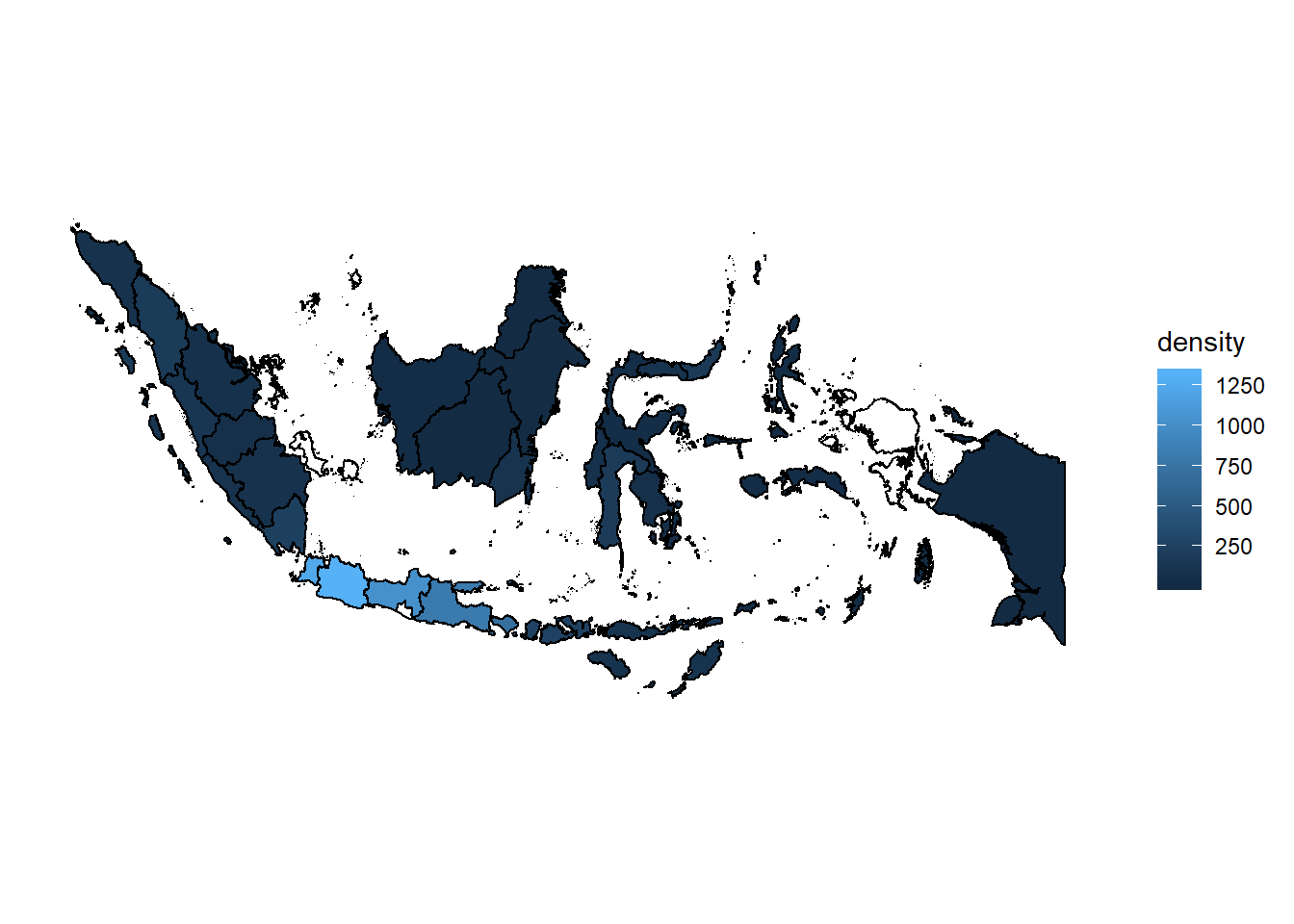
Time to the main part of this analysis, plotting the density map.

 1
 2
 3
 4
 5
 6
 7
 8
 9
10
11
12
13
14
15
16
17
18
#need this to remove background and outline of graph
ditch_the_axes <- theme(
  axis.text = element_blank(),
  axis.line = element_blank(),
  axis.ticks = element_blank(),
  panel.border = element_blank(),
  panel.grid = element_blank(),
  axis.title = element_blank()
)
#plot the map
map_pop_density <- ggplot(data = idn_shape_df, mapping = aes(x = long, y = lat, group = group)) +
  coord_fixed(1.3) + 
  geom_polygon(aes(x=long,y=lat, group=group, fill=density), data=idn_pop_density, color='black') +
  geom_polygon(color = "black", fill = NA) +
  theme_bw() +
  ditch_the_axes

map_pop_density

Final touch

Cool! but it looks like it’s hard to discern the different in area. Let’s make it clearer by transforming the value of density by log10 , reseve the density color to make the more dark color indicate the more dense area also change legend title.

1
2
3
map_pop_density + scale_fill_gradient(trans = "log10", 
                                      high = "#132B43", low = "#56B1F7",
                                      name="jiwa/km2")
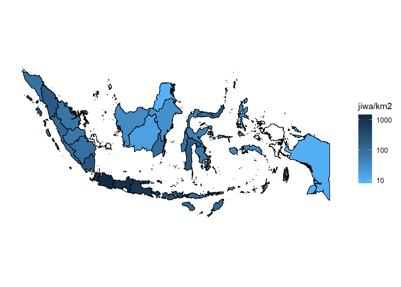
Looks better now. Nothing special with the data as we know that Java has very high population compared to others province/area in Indonesia, and we are not discussing about that point this time. This is just an example of how to visualise map/spatial data especially for Indonesian area using R which is open source (free) tools instead of using paid tools. We can then replace the fill by others value like number of sufferer of certain desaese to map the its spreadness or others data we desire.

Note : If you notice there are some provinces that has white color, It’s because the province name on data from BPS and .shp file has different value. So when we join that two tables by province name, some rows doesn’t match. For example Kep. Riau and Kepulauan Riau, Papua Barat and Irian Jaya Bara, Bangka-Belitung and Bangka Belitung. It needs further processing to handle this may be using regex join etc. But i won’t cover that on this post.

Refference:

What is Machine Learning?

Machine learning (ML) menjadi salah satu hot topic dalam dunia riset bidang teknologi dan sains dalam satu dekade terakhir. Lalu apa sebenarnya ML itu?

Tanpa kita sadari, sebenarnya setiap hari kita telah bersentuhan atau menggunakan aplikasi dari ML dalam aktivitas sehari-hari. Saat kita membuka facebook, news feed di krolonologi kita telah difilter untuk menampilkan news feed yang mungkin kita suka saja, saat membuka youtube kita akan melihat suggestion video yang sesuai dengan kegemaran kita, dan saat membeli barang di e-commerce atau membaca artikel di sebuah situs berita, kita akan di berikan rekomendasi barang/artikel yang berdekatan dengan interest kita, juga folder spam di email kita yang terisi sendiri tanpa perlu kita filter. Itu adalah beberapa contoh sederhana penerapan ML yang memudahkan kehidupan kita sehari-hari.

Definition

Sama halnya dengan data scientist, definisi ML sendiri ada banyak versi karena belum ada definisi baku yang di disepakati. Tetapi, definisi yang terkenal adalah pendapat Arthur Samuel yang mengatakan bahwa.

Machine learning is field of study that gives computer ability to learn from data without being explicitly programmed. (Arthur Samuel, 1959)

ya, perbedaan ML dengan progamming biasa adalah kita memberikan kemampuan kepada komputer untuk belajar sendiri dari data sehingga dia akan tahu tindakan apa yang seharusnya dilakukan berdasarkan data yang kita berikan tersebut, tanpa perlu menghandle segala kemungkinan sebagaimana programming biasa/tradisional lakukan.

Software apps are programmed, intelligent apps are trained (with data). (Carlos Guestrin)

Kevin P. Murphy dalam bukunya Machine learning : A Probabilistic Perspective memberikan definisi yang lebih “statistika” soal ML. Dia mengatakan bahwa ML adalah

A set of method that can automatically detects pattern in data, then use the uncovered pattern to predict future data, or perform other kinds of decision making under uncertainty (such as planning how to make collect to data). (Kevin P. Murphy)

Task

ML adalah subfield dari artifficial intelligence yang memadukan pendekatan computing dan juga matematics/statistics (liniar algebra, probabilistics, etc) sehingga jika ingin belajar ML harus punya bekal pengetahuan programming dan juga statistik untuk bisa menguasainya. Dalam hal permasalahan/kaskusnya, ML dibagi menjadi 3 bagian, yaitu:

Supervised learning

Pada supervised learning kita memberikan input data yang output atau responnya diketahui. Kemudian algoritma ML akan belajar dari data tersebut sehingga mampu memrediksi output atau respon dari data baru yang diberikan. Berdasarkan responnya supervised learning dibagi menjadi 2, yaitu:

  • Classification

    Jika responnya adalah kategorik, maka kasusnya dinamakan classification. Misalnya adalah kita ingin memprediksi seseorang terkena kanker atau tidak, responnya adalah ya dan tidak. Algoritma yang digunakan untuk classification adalah logistic regression, support vector machine, decision tree, random forest, naive bayes, neural network, dsb

  • Regression

    Kasus regresi adalah jika output atau responnya bersifat continue. Contoh kasusnya adalah prediksi harga saham, prediksi harga rumah, prediksi curah hujan dsb. Contoh algoritmanya adalah linear regression, polynomial regression, classification and regression tree (CART), random forest regression dsb.

Unsupervised Learning

Jika supervised learning memetakan input x ke output y, unsupervised learning tidak memiliki output sehingga yang dilakukan oleh algo-algo unsupervised learning adalah menemukan interesting pattern dari data yang ada. Contoh kasusnya adalah segmentasi customer dari e-commerce berdasarkan behaviour mereka sehingga tim marketing bisa memberikan treatment yang tepat sasaran sesuai dengan behaviour user. Contoh algoritmanya adalah k-means clustering, hierarchical clustering, mixture models dll. Selain clustering, pendekatan lain yang termasuk unsupervised adalah anomali detection dan dimensional reduction.

Reinforcement Learning

Dibandingkan dua kasus sebelumnya, RL bisa dikatakan lebih rumit tetapi lebih mendekati kasus yang terjadi dalam kehidupan nyata di dunia ini. Definisi RL adalah permasalahan untuk menemukan rule yang mengoptimumkan reward dalam suatu kondisi yang mana di kondisi itu terdapat reward dan punishment saat melakukan hal-hal tertentu.

Agak susah sebenarnya menjelaskan apa itu RL, untuk lebih mudahnya analogikan saja seperti ini, kita ingin melatih kucing peliharaan kita agar tidak buang air sembarangan, kita tidak mungkin memberi tahu kepada kucing tersebut dengan bahasa kita karena dia tidak akan mengerti, maka cara yang bisa kita lakukan adalah memberikan reward misal makanan jika kucing kita buang air ditempat yang seharusnya dan juga punishment jika dia melakukan hal sebaliknya. Dengan sendirinya lama-kelamaan kucing kita akan mengerti mana yang harus dilakukan dan mana yang tidak boleh dilakukan berdasarkan reward dan punishment yang ada. Kita juga bisa menerapkan hal tersebut ke komputer. Contoh algoritma RL adalah markov decision process (MDP), multi arm bandit (MAB) dan A/B testing.

Future

Sebagai bagian dari rumpun ilmu artificial intellegence (AI), ML masih akan banyak dikembangkan baik di dunia riset maupun industri seiring dengan berkembangnya riset dan aplikasi AI saat ini. Topic yang sedang hot saat ini diantaranya adalah self driving car, deep learning, computer vision dan NLP.

Referensi :

featured image

Battle of Aksi 212 on Twitter: Social Network Analysis Perspective

Aksi 212 is only one day away. Netizens both pro and contra side are hyped about the event. They actively tweets (or retweet or copas) about the event. I am curious about seeing the hyped in another side. I want to see the battle of pro and conta side in twitter.

To fullfil my curiosity, I crawled data from twitter a day before aksi 212 (December 1, 2016). In order to simplify the analysis, I only crawled 1500 tweets contains keyword “aksi bela islam” on that period.

By applying social network analysis method, the collected tweets then visualize to find its network structure. Tools I used to done this task is R for collecting and preprocessing data, and Gephy for visualizing network.

The Battle is Real

After doing some preprocessing and preparation of data, here is the network visualization of data I’d collected.

Social Network of #aksibelaislam

What the graph tell us?

  • The battle is real! there are polarization between netizen who’re pro and contra with aksi 212. it created 2 main clusters wich is disconnected
  • @maspiyungan dkk in pro side vs @zevanya in contra side. The pro side is more dominant than contra side. They clustered in one big cluster and connected each other formed (very) big buble, while in contra side only @zevanya gathered big buble (red circle), others Ahok’s buzzer like @digembok @gunromli etc just created small buble (smaller red circle)
  • It’s about 6 influencers who’re pro with “aksi 212” gathered and formed big bubble. They are @maspiyungan, @husainiadianm @GrabJakmania, @posmetro, @hidcom and @wartapolitik. Their network are close and connect each other. It means netizens who’re pro with aksi 212 interacted with all influencers.
  • While in contra side (red circle), there is only one influencer which is got high interaction, it’s @zevanya. There’s also other influencer with small interaction but it’s far and not connected with main influencer. That’s mean the netizens who’re interact with @zevanya didn’t interact with other influencer, they have different network.

Network Characteristic

If we refer to Michael Lieberman paper network characteristic in SNA, then the network characteristic of my data be like this.

  • Aksi 212 in general
    • Polarized Two main clusters (pro side and contra side) with no interconnection
    • Bazaar Many small/medium groups, some isolates
  • Pro side
    • In-group Many connection, few disconnected isolate
  • Contra side
    • Broadcast A hub which is retweeted by many disconnected users

Crawling Data Twitter Menggunakan R

Note : Artikel ini dipublikasikan pada 2016 diblog lama saya, tapi contoh code nya diperbarui dengan data terbaru saat dipindah keblog ini

Pada postingan sebelumnya, saya telah sedikit berbagi tentang social media analytics dan sempat menyinggung sumber data yang digunakan dalam social media analytics diantaranya sosial media, news portal, blog dll. Kali ini, saya akan berbagi salah satu tahap awal dalam analytics yakni pengumpulan data (data harvesting). Sesuai judulnya, postingan ini akan membahas tentang cara mendapatkan data dari Twitter sebagai bahan analisis. Dari sosial media populer seperti facebook dan instagram, twitter ini yang paling baik soal open access data. Twitter memberikan akses kepada khalayak untuk mengkonsumsi data mereka lewat API yang mereka sediakan. thanks Jack Dorsey!. API twitter sendiri terdiri 2 jenis yaitu REST API dan Streaming API. Lebih afdholnya langsung ke TKP aja gan untuk penjelasannya :D. Secara singkat bedanya, kalo REST API kita ngambil data di masa lalu hingga sekarang, kalo streaming API kita ngambil data mulai dari sekarang hingga ke depan tergantung berapa lama kita mau ambil. Nah kali ini kita akan menggali kenangan masa lalu di twitter lewat REST API.

Terima kasih kepada sohib kita Jeff (sok kenal) yang sudah membuat package R yang dia beri nama twitteR sehingga kita tinggal dengan mudah menggunakannya lewat function-function yang udah dibuat. Oke langsung saja ke tahap-tahapnya.

1. Gernerate access token

Generate access token API key dan API secret untuk bisa mengakses twitter API. Cara membuatnya langsung saja ke tulisan ini, inshaa Allah cukup jelas.

2. Install twitteR package

Ada 2 cara untuk install package di R, pertama dengan build in function di R install.package atau melalui github repository menggunakan package devtools install package dari CRAN Ini cara paling praktis untuk install package ke R, caranya sangat mudah tinggal tulis fungsi install.packages(“package_name”) package akan otomatis terinstalll beserta dependensinya.

install package melalui Github menggunakan library devtools Terkadang ada package yang belum terdaftar di CRAN sehingga belum bisa kita install menggunakan install.packages, tapi kita tetap bisa menginstall package tersebut melalui repository development-nya dengan bantuan package devtools.Berikut adalah syntax untuk install twitteR package dengan dua cara diatas:

1
2
3
4
5
6
#install twitteR package dari CRAN
install.packages("twitteR")

#install twitteR package dari github repository
library(devtools)
install_github("twitteR", username="geoffjentry")  

3. Aktifkan package dan twitter authentication

Setelah twitteR package terinstall, kita tinggal mengaktifkan package dengan function library(twitteR), setelah itu kita perlu melakukan proses autentifikasi menggunakan credential yang kita dapat di step 1 untuk bisa mengakses API twitter. Di package twitteR sendiri telah ada fungsi untuk menjalankan autentifikasi tanpa perlu menggunakan bantuan package lain seperti httr.

1
2
3
4
5
6
7
library(twitteR) #aktifkan package twitteR

api_key = "xxxxxxxxxxxxQylT" #change with yours
api_secret = "KZCxxxxxxxxxxxxxxxxxxxxxxxiQy" #change with yours
token = "38xxxxxxxxxxxxxxxxxxxxxxxnsp" #change with yours
token_secret = "IYxxxxxxxxxxxxxxxxxxxxxxxxxxORkf7" #change with yours
setup_twitter_oauth(api_key, api_secret, token, token_secret) #fungsi untuk autentifikasi

Setelah credential telah diaktifkan, sekarang kita sudah bisa mengakses data dari API twitter.

4. Crawl data dari twitter

Untuk menggenerate data kita menggunakan fungsi searchTwitter, fungsi ini mempunyai beberapa parameter, yang terpenting adalah keyword yakni keyword apa yang ingin kita download dari twitter. Kita juga bisa menambah parameter n yakni jumlah tweet yang ingin kita ambil serta mengatur waktu dari rentang kapan data yang mau kita ambil (tentunya dari masa lalu hingga sekarang). Berikut contohnya.

1
2
#ambil 100 tweet berbahasa indonesia yang mengandung keyword corona dari tanggal 7 hingga 9 Februari 2020
tweets = searchTwitter("corona", n = 1000, since = "2020-02-07", until = "2020-02-09", lang = 'id')

searchTwitter akan mengembalikan data bertipe list, jika ingin melakukan analisis akan lebih mudah jika kita menggunakan data bertipe data frame, untung saja di twitteR telah ada build in function untuk merubah data bertipe list ke data frame menggunakan fungsi twListToDF.

1
2
3
4
#merubah data list ke data frame
tweets_df = twListToDF(tweets)
#data telah berbentuk dataframe dan siap dianalisa
names(tweets_df) #untuk melihat kolom apa saja yang dimiliki oleh data
1
2
3
4
##  [1] "text"          "favorited"     "favoriteCount" "replyToSN"    
##  [5] "created"       "truncated"     "replyToSID"    "id"           
##  [9] "replyToUID"    "statusSource"  "screenName"    "retweetCount" 
## [13] "isRetweet"     "retweeted"     "longitude"     "latitude"

output : searchTwitter memberikan data dengan 16 kolom sebagai diatas. contoh tweet yang kita dapat adalah.

1
head(tweets_df)
 1
 2
 3
 4
 5
 6
 7
 8
 9
10
11
12
13
14
15
16
17
18
19
20
21
22
23
24
25
26
27
28
29
30
31
32
33
34
35
##                                                                                                                                                  text
## 1                                                          RT @MrZiel: @datteamejanai @cheesyfloat Kejang kejang karna corona paling dikira kesurupan
## 2 RT @dr_koko28: CORONA VIRUS\n\n- 722 people dead\n- 5900 in serious condition\n- Over 34,000 infections\n- Cases confirmed in 25 countries.\n\nAdv…
## 3     RT @msaid_didu: Semoga Bpk paham bhwa \nPertumbuhan 5 % itu sampai Desember 2019.\nCorona baru terjadi Januari 2020 dan itu di China.\nMari ki…
## 4        RT @fahiraidris: Baru-baru ini #Singapura meningkatkan status ancaman virus #Corona di negaranya. Kemlu pun mengingatkan wisatawan Indonesi…
## 5                                              RT @CNNIndonesia: Korban Meninggal Akibat Virus Corona di China Jadi 803 Orang https://t.co/pdMvH2av9a
## 6     RT @SisiLusipara: Pedulikah Ia?\n\nPM Singapura Unggah Imbauan Waspada Corona via Youtube, Bagaimana Jokowi?\nDownload Link || https://t.co/so…
##   favorited favoriteCount replyToSN             created truncated replyToSID
## 1     FALSE             0      <NA> 2020-02-08 23:59:57     FALSE       <NA>
## 2     FALSE             0      <NA> 2020-02-08 23:59:55     FALSE       <NA>
## 3     FALSE             0      <NA> 2020-02-08 23:59:42     FALSE       <NA>
## 4     FALSE             0      <NA> 2020-02-08 23:59:42     FALSE       <NA>
## 5     FALSE             0      <NA> 2020-02-08 23:59:39     FALSE       <NA>
## 6     FALSE             0      <NA> 2020-02-08 23:59:38     FALSE       <NA>
##                    id replyToUID
## 1 1226294626266439681       <NA>
## 2 1226294620373405696       <NA>
## 3 1226294566178848769       <NA>
## 4 1226294565889462272       <NA>
## 5 1226294551771398144       <NA>
## 6 1226294548936052736       <NA>
##                                                                           statusSource
## 1 <a href="http://twitter.com/download/android" rel="nofollow">Twitter for Android</a>
## 2 <a href="http://twitter.com/download/android" rel="nofollow">Twitter for Android</a>
## 3 <a href="http://twitter.com/download/android" rel="nofollow">Twitter for Android</a>
## 4 <a href="http://twitter.com/download/android" rel="nofollow">Twitter for Android</a>
## 5 <a href="http://twitter.com/download/android" rel="nofollow">Twitter for Android</a>
## 6 <a href="http://twitter.com/download/android" rel="nofollow">Twitter for Android</a>
##        screenName retweetCount isRetweet retweeted longitude latitude
## 1   serendipitwty          826      TRUE     FALSE        NA       NA
## 2     GilangGum29          343      TRUE     FALSE        NA       NA
## 3  Voirmountagnes         2362      TRUE     FALSE        NA       NA
## 4       AbolichdZ          421      TRUE     FALSE        NA       NA
## 5 NovrikoSulistio          228      TRUE     FALSE        NA       NA
## 6   anitamarlian2           41      TRUE     FALSE        NA       NA

Parameter diatas seperti keyword, n, date range dapat kita ubah sesuai dengan keinginan kita, bisa juga kita menambahkan parameter lainnya sesuai dengan yang ada di dokumentasi twitteR package. Tentu saja, REST API ini punya limit dalam memberikan data kepada client baik rentang waktu yang bisa diakses maupun jumlah tweet yang diberikan, ada baiknya untuk membaca dulu dokumentasi twitter API sebelum mengaksesnya baik melalui R, python atau bahasa lainnya. Sekian, semoga bermanfaat.

featured image

Jokowi's Cabinet Reshuffle Buzz

Background

President Joko Widodo announced cabinet reshuffle on 27th July, 2016. A move aimed at enhancing the effectiveness of his cabinet. This thing generated mixed responses from netizen. Some are pros and others are cons. Knowing about what people think about reshuffle looks interesting. So, I analyze what people talk on twitter regarding reshuffle topic by tracking keyword “#reshuffle” then extract information from there.

Data

I collected data from 27 July 2016 till 3 August 2016 and got total of 15,290 tweets contains hashtag #reshuffle (of course, actually more than that number of tweets about #reshuffle out there). I use twitteR package by Jeff Gentry to crawl the tweets.

Analysis

Type of Tweets

Let’s start the analysis by knowing the tweet behaviour over #reshuffle keyword on twitter.

Type of tweet

It seems netizens is more like to retweet people tweet (55.4%) instead of express their own thought (tweet, 42.5%). Few of them (2,07%) did further discussion by replying tweet each others. Tweet’s rush hour

This graph shows the distribution of time used by netizens to active on twitter. It looks netizens more like to spend their morning time to active on twitter instead of in the night. Peak time is at 8.00 am.

Influencer

Now, we will find out who’s the ‘buzzer’ on twitter that spread tweet about #reshuffle. Here you go.

Top 5 influencer of #reshuffle

There are total of 6081 unique users posted about #reshuffle on that period with impression 837,660,066. Graph above shows the top 10 twitter accounts who posted the most.

Who is the star?

Below is the popularity distribution of ministers that get involve in this cabinet reshuffle. Let’s see who is the most talked (popular) minister over reshuffle issue. Top mentioned ministers

Woa!, Anies baswedan is the most popular minister over #reshuffle topic. Followed by Wiranto, Sri Mulyani and Ignasius Jonan.

What’s netizens thought?

Ok, in above we have known ministers that are populer among netizens. So, what their thought about them? Did they say good sentimet or vise versa?

Let wordcloud answers your question. Wordcloud below is clustered wordcloud for top 4 popular ministers that mentioned the most by netizens. Clustered wordcloud over top 4 popular ministers.

Wiranto Wiranto is linked to law issue since terms most appear around him are ‘kejahatan’, ‘dakwaan’, and ‘ham’.

Anies Baswedan Anies Baswedan seems got positive impression by netizens. They thanks to Anies for his performance, netizens also dissappoint about the replacement of Anies Baswedan

Sri Mulyani People are welcoming back Sri Mulyani, they hope she can heal ou economy.

Ignatius Jonan Ignatius Jonan, got mixed sentimen from netizen. Some are agree with his replacement, others are disappoint regarding his replacement because they think Jonan is good enough.